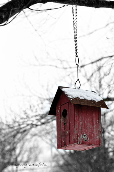
Once upon a time there was black and white film and then there was color film. Time and technology marched on and then came digital and Photoshop, Gimp, ACR, and many many more ways to “massage” an image into something other than what it was originally. Not every alteration of the original image is a winner but as with every other thing in life – beauty is in the eye of the beholder and your mileage may vary. Having said that, there are innumerable ways to change an image what with levels, gradient maps, filters, saturation, blending modes and actions….lots and lots of actions. There are actions out there that can help you render an image into just about any kind of look you want; you just have to go out there and try them – or not. The choice is entirely yours.
Yesterday I posted one version of a birdhouse I captured while it was snowing. I converted it using an action that gave it just a hint of an old fashioned sepia tone. So with the five conversions here today I’ve done one birdhouse x 6 ways. Anyway, it was fun to experiment and you never know what you may end up with when you try. Again, not every conversion may be a winner but you never know till you try. Please leave a comment telling me which version/s you liked (or not) and why.
The original color image
The black and white version
The selective color version
A colorized version
And a vintage sepia version


I like the first one. The bright red birdhouse in front of the ‘relatively’ and naturally black and white snowy background clearly draws the attention.
Thanks for commenting, Chris. The red of the birdhouse does stand out 🙂
Love the sepia.
Reminds me of old photographs. Thanks for stopping by.
I love it! You know I’m a fiend for ‘variations on a theme’. Especially beautiful subjects that don’t grow old and tired with the repetition. Thanks!
You are very welcome! Not every subject will “morph” well but when they do the outcomes are fun to see.
It’s interesting to see the different versions in a group like this. My fav is the vintage sepia version! Probably because it is warmer even though it is a winter photo…if that makes sense.
Not quite getting the warmer but color temp is in the eye of the beholder! 🙂
Such talent lady….I even added a new page to my blog – “As Seen Through my Car Window” –
Cool! I’ve done a few of those but usually roll down the window and sometimes lean out 🙂
While driving…gurl you crazy!
No silly…well wait a minute. While at a stop light or when DH is driving and I’m the passenger 🙂
I know….silly willy!
Yeah, yeah, yeah. They’re all great, though I’m partial to the first one. BUT, let’s get to more important matters. Your new gravatar image looks fantastic! Now that’s a good photo!
Yeah, yeah, yeah? WELL! So ya noticed I changed the gravatar image did ya? LOL Thanks
I am torn. I like #2 because of the color, but I also like the last one because I have a think for vintage-y photos.
I am rather fond of sepia(ish) with a bit of color pop. Best of a couple of worlds? 🙂
My eyes keep going back to the selective color version. Usually I try to stay away from that, but I love the pop of red! Very nice!
The little red house is a standout which makes any image where it shines through a good one. I like the colorized one as it adds age to it without taking away much of the red.
I think each image is very thoughtful. It would depend on the use of the photo. I really like bold colors so the red in the original is lovely to me.
-Karen
http://www.yourstylistkaren.com
That is what makes the world go around – everyone likes something different. I too like the images where the red comes through.
great photo
It was a cute little bird house.