So what is the Orton Effect? According to Wikipedia ‘Orton imagery, also called an Orton slide sandwich or the Orton Effect, is a photography technique which blends two completely different photos of the same scene, resulting in a distinctive mix of high and low detail areas within the same photo.[1] It was originated by photographer Michael Orton in the mid 1980s.’
When I first used it some years ago, I mainly applied it to my flower photography but never thought about using it for anything else. Recently I read an article about landscape photos using the Orton effect. The article is from Photography Life and you can read it here if you haven’t already. In the article there’s also a tutorial on how to implement it in your own images – and why you may not want to. The writer of this article felt it was possibly taking over landscape photography. I neither agree nor disagree with him. Yes, it can be over done on images; any editing technique can. The idea is to find that fine line of just right versus over done or barely done – your image, your taste.
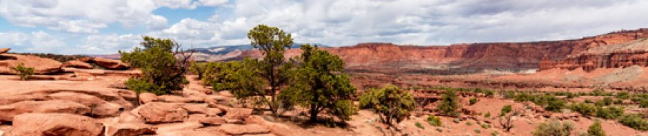
It had been a long time since I “Ortoned” any images so I decided to give it a try and see how I liked it for a landscape photo. I had an old PS action that did the work for me as compared to my doing all of the layers and blending modes. Doing it myself would’ve afforded me more control over aspects of the technique but this was just an experiment so I went the hard and fast action route. I picked this image from our visit to Sedona, Arizona in 2013. The first image is a typical edit with just the usual levels and clarity adjustments. The second was edited using the Orton Effect. While I like the soft glow and the vibrancy of the Orton image, it’s that very thing that made the row of green trees look like steamed broccoli to me. You could say the first image has a bit of that going on too but there is more detail in the trees which makes for a bit less cooked veggies resemblance. To me, the Orton Effect comes close to resembling the painterly effects you can get when using a program like Topaz Simplify for example.
My opinion is that with the right image and a not so heavy hand, the Orton Effect can give you a great finished photo with an artistic twist. Will I be using it more? I don’t know. As with all of my edits it depends on what I am trying to convey with the photograph. Which image do you prefer and why? And have you or will you use the Orton Effect on any of your photos?
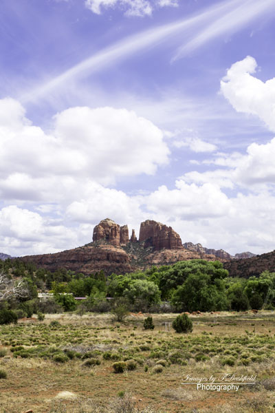
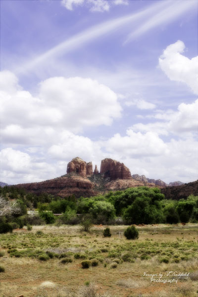


In this case I prefere the first image. I sometimes use the Orton effect on landscape, it makes it more vibrant and sometimes it adds a mood, especially to darker settings. But your words and images reminds me to be very light handed and choosy. Thanks! 🙂
You’re welcome. Isn’t photography and editing fun (sometimes lol) because of all the images we can ultimately create?
😊👍🏻
I use the Orton effect on certain images, but rarely do I use it for he entire image – usually I do a blend in PS with layers and masks…but you are correct, it does need to be used carefully with the right image. I’m going non-Orto with your two. I like the harder details in the straight shot.
Thanks. I will have to learn how to do only parts of an image in Orton to see how I like it…or not.
I did a Orton-type effect by accidentally exposing the same 4X5 negative of the same scene from two different locations. It came out surprising well (I posted the photo on 12/31/2014). Otherwise, I rarely use it in digital photography. I never did it with slide film, but I used to put two or more negatives together and make prints back in the 80’s. To me the Orton effect is the precursor to HDR.
Art and photography are an every evolving craft. As I’ve stated here, do what makes you happy with the results in the end.
I like both of them for different reasons. The original gives me a sense of the beauty of the land while the other is invitingly dreamy. If that makes sense.
It makes perfect sense. Thanks for commenting 🙂
I do like the “glow” the Orton Effect creates, but overall I prefer the original. Take that with a grain of salt, though; I’m not even a big fan of HDR.
Thanks. I like HDR in modification with things that are shiny like buildings or cars. Then it works.
I like them both, but with the white background (of the blog page) I prefer the original. When set against a darker background, I probably would prefer the Orton. Great shot, T!
Thanks. And you looked at them in your own way. Hadn’t even considered about background colors.
I think you hit the nail on the head in the last paragraph – it’s not for every image and with the right image you can get a great result. No harm in experimenting though – its how we learn stuff.
One cannot learn without experimenting sometimes. Thanks.
I have used it in the past… it make colors pop or not pop.
I like the first image in this case. But… whatever floats your boat.
HEY, girl! Missed you but I think I am back. Life gets in the way of blogging. Had so much to attend to.
Hopefully, I can edit my next set of pictures from the trip.
Hugs to you!
And Nancy is back!!! Now can I go on a cruise? hehehehe